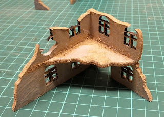
I've assembled some test buildings and experimented with texturing to make them more visually interesting.
I've painted PVA into the joints, pressed them together and painted some more PVA along the inside of the joint. This creates a good, strong bond once it has dried. I've used some coffee stirrers to add floors in one of the larger buildings that came with no internal detail.
Wood filler is smeared over the joints, then sanded smooth when dry to help conceal them.
The walls are textured with a mixture of tile grout and PVA, plus a few drops of black paint to give it a grey colour. This hides the filler on the joints and blends the lintels and window sills into the structure.
I add the paint so that if the scenery gets bumped and chipped, the grey blends in rather than standing out as a bright white scar. The buildings scale well against my existing home-made foamcore and it will be easy to add in some extra walls here and there using some of my foamcore scraps.
I've left the etched brick areas uncovered. At this scale, the thickness of the texture paste is enough to look like broken render around them. A sheet of thin plaster crumbled to small fragments will be sprinkled in the rubble under these chipped areas on the finished game board to simulate the flaked off render.
Broken edges of wall have been painted with PVA and sharp sand mixed with brown grout sprinkled over them for a rubble effect. Some patches of rubble have been added on the floors inside.
I'll be able to mix and match the various corner sections to create different ruins, so re-use of 3 identical sets of ruins will be much less obvious.
Many of the ruins include damaged floor sections - you can see in this example that the bottom of the windows are sometimes very close to the floor, but this doesn't seem to be as noticeable on the first floor as it would be on the ground floor. The floors are the same 3mm MDF, so quite chunky.
There are a range of window styles across the different buildings. Although this will limit which ruins I can put together to create buildings, I like the variety that it will bring to the table.
Some of the ruins have a small internal wall section to add. In this instance, I added it on the outside of the building instead. It will probably be more useful out here, where it will provide extra cover and won't interfere with putting figures inside.
I've cut some more angular bites out of the broken sections of wall, where whole bricks will have been knocked loose. A lot of MDF ruins have breakages that I think look too curving and smooth, and not how walls really break and collapse, in a more angular way.
These test ruins have been valuable for experimenting with a few different techniques and the rest of the buildings should go together pretty easily when I have the time to work on them.


No comments:
Post a Comment