Saturday, 10 June 2017

Bricks! Adapting Linka for 15mm - part 3: painting.

With assembly complete, it's time to start painting.  I've used mainly Inscribe craft acrylics with Vallejo acrylics for a few extra colours.

Paints at the ready!
My painting procedure is as follows:

1) Base coat of Vallejo cold grey and inscribe taupe.  This gives a nice cement-coloured finish.  For future buildings I'll probably just use taupe with a few drops of black added, this gives a similarly grey-brown colour.  It doesn't matter if the ratios vary between batches, this will add variation in colour which will be more realistic.

Basic cement coat complete

2) Brick coat of Inscribe burnt umber.  I use a wide, flat brush, wiped diagonally across the bricks with the bristles almost parallel with the surface.  This coats the bricks well but leaves the recessed cement lines showing.  Because this was a quick trial run, I didn't take the usual care when plaster casting so there are a number of bubbles in the bricks of the larger building which are more noticeable once painted!

Basic brick coat complete

Brick coat detail.
 
3) Pick out individual bricks in different shades by adding Inscribe black, burnt sienna (terracotta) or caramel (yellow-brown) paint to the base colour.  It's a random scattering of bricks across the building.  As always, click on the pictures if you want a close-up.  Apologies for the variations in colour, these were photographed at different times under different light sources!

Note wonky doorway on left!

Windows.

Click for close-up.

Click for close-up.
The wonky doorway on the ridge roof building is even more noticeable when viewed next to the flat roof building!

Wonky doorway even more noticeable here!
This being just a quick proof-of-concept trial, I haven't worried about filling the gaps between the trimmed window sections.

Trimmed window a better size for 15mm.

Another trimmed window - note the gaps!

Brick variation detail.

4) Paint window frames white.

5) I decided that one of the buildings would have a site number on the side.  I printed out the number in 72-point Impact font which is nice and chunky.
 
Font size selected to fit building.
The number was carefully cut out with a craft knife to create a stencil which was folded around the wall and secured with a small piece of masking tape.

Stencil carefully cut out.

Stencil in place, lined up with bricks.
 Originally it was going to be on the smaller building but I realised that it would help hide the aforementioned bubbles in the wall of the larger building!

Changed my mind!  Use it on this building instead.
 Vallejo stonewall grey was stippled through the stencil followed by a further stippling of white.  This gives the effect of some of the paint being paler and slightly worn away.  The stippling was quite rough, the incomplete coverage adding the effect of wear and tear.

Stencil completed.

 The roof was painted in burnt umber with a few black tiles for variety.


Roof base colour.

 A heavy drybrush of burnt sienna gives a nice terracotta finish.  A few drops of caramel yellow was added for the final highlight.


Terracotta drybrush.
Part 4 will involve constructing a base for the buildings.

Completed Building 19.

Sunday, 4 June 2017

Bricks! Adapting Linka for 15mm - Part 2: assembly

For my test structures I've built a couple of small sheds, the sort you might find on an industrial site as plant rooms or small storage buildings.  One has a pitched roof, the other will be a flat felt roof.  I've decided to use some of my sheet styrene/plasticard Flemish pantiles for the pitched roof, this will be lighter and more durable than trying to construct a roof from Linka tile sections.

Assembled test buildings
Unfortunately the doorway has ended up slightly wonky on the pitched roof building.  I realised afterwards that I should have glued the roof apex section and the doorway together first.  The door tile cracked in half when I was removing the door itself and unfortunately when glued together it wasn't quite straight!  Gluing it to the apex section would have ensured it was straight before I added the side walls.

The 2-section side walls are assembled by placing the sections brick-side down on a non-stick surface such as a polythene pocket file, this ensures the dry flat and straight.  I just use PVA glue, slightly thinned with water and painted onto all the edges of the connecting lugs with an old paintbrush.

Flemish pantile plasticard is great stuff! It is easily cut to size, although the normal "bend-and-snap" approach needs to be adjusted slightly due to the 3D texture.  As you can see, I started on the roof when the painting of the buildings was already underway.

Roof sections cut to size

 I've added a piece of styrene tube to form the ridge and provide a stronger join along the top.

Assembled roof
Internal bracing will strengthen the roof and ensure it keeps the correct roof angle/shape.

Interior of roof showing bracing panels

 In part 3 I'll start the painting.

Friday, 2 June 2017

Bricks! Experiments with Linka scenery

In response to Phil's comment about my bricks, I thought I'd do an article specifically on Linka scenery and how it can be adapted to 15mm.

For those who haven't encountered it before, Linka is a range of thin rubber moulds which can be used to cast interlocking panels to create walls, roofs etc.  They come in a variety of styles including brick, stone and roof tile.  There are moulds for plain wall sections, windows, doorways and more.  I cast mine using Crystacal R casting plaster, the same as I use for my Hirst Arts dungeons.

The scenery used in my Action Force photographs is built without modification (other than breaking and crumbling on the ruins) but the doorways look slightly too large when viewed more closely.


Standard door
I was fortunate enough to pick up some Linka moulds on ebay a few months ago, the basic set comprising 4 moulds:
1) plain brick sections;
2) a basic assortment of door and window sections;
3) accessories (garden walls, coping, angled walls etc);
4) roof tiles & chimney pots.

Basic Linka moulds
Being designed for OO/HO railways and 1/72 or 1/76 modelling, the standard blocks look OK from a distance but the size discrepancy with 15mm figures is much more obvious close-up.  My initial experiments were just to see how easy they were to stick together and how well they could be painted.  My next experiment is how well they can be adapted for 15mm scale.

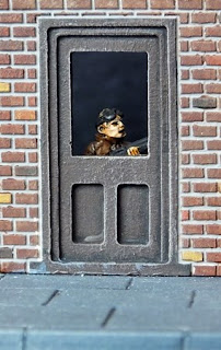
Door and window
Window

Door with window
Regardless of whether 15mm means to the top of the head, to the eye level, or just 1/100 scale, I have found that reducing the height of the standard panels by 4 layers of bricks gives a pretty good size match for my various figures.  This was easily achieved with the plain brick sections, I simply scored along the appropriate mortar line a few times with an old dental tool (a craft knife would do the job pretty easily too), then snapped off the lower 4 courses of bricks.  I scored the plaster before it had dried fully - it was set hard and easy to de-mould but not quite as brittle as when it is completely dry.  I've tried this on some previously cast pieces since then, they are harder and require a few more scrapes with the dental tool to score them deeply enough but it's still fairly easy.  The key thing when snapping them is to place something underneath the scored line (eg handle of dental tool, small paintbrush, knitting needle) and press evenly on both sides, just like snapping a scored ceramic wall tile.  The snapped-off sections are ideal for small bund walls like you find around liquid storage tanks.

Off cuts suitable for use as bund walls
With door sections, the door frame needs to be scored carefully as well as the cement lines and the door itself often needs to be removed because the inset panels are the wrong size.  One particular difficulty with door panels is removing the actual door, this can result in the entire section breaking in half, more on this in part 2...

A range of doors and windows
Windows are more difficult - if you remove the lower 4 brick courses, the bottom of the window is at ground level!  While  this might be desirable in some instances, most of the time it will look rather odd so I've removed the middle 4 brick courses.  This requires a little more care because both edges need to be quite accurate to ensure a clean fit of the two halves and the centre section tends to snap rather easily.  With doors and plain wall sections, it doesn't matter if the base edge is a little rough because you can hide it quite well by judicious application of vegetation or other base texturing.  Careful sanding is required, though it's easy to remove too much, as I discovered.

Re-sized window and door
In part 2 I'll move on to assembling a couple of trial buildings.